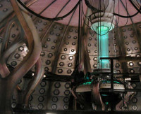
 Rumours abound about the new TARDIS set. It was only a matter of time before news of the new TARDIS interior leaked, perhaps we have already reached that point. Someone (sorry, I’ve no idea who) posted the following to (I believe) gallifreybase.com, before it was allegedly removed and then copied by various websites around the world (including this one!):
“The set is on 2 levels, joined by a spiral staircase, but is not as big as I’d thought. It’s apparently finished though sections of it seem to be missing at present. We saw the console room, a lab area, a sort of sitting room area, a fairly long section of corridor leading nowhere and numerous other little nooks and crannies. The console room reminds me of a new and shiny version of the old one, except the roundels are very simple and basic looking, simply spherical dents in the walls.
These new style roundels are featured throughout the whole set, though not on every wall. Back to the console room – mainly golds and silvers and the coral theme has been replaced with a smooth marble like finish. Also the room is not circular, it’s a kind of hexagon-joined-to-a-square shape, the hexagon bit containing the console, which to me looked like the same console they’ve used throughout the series except with new buttons and blinky lights, though apparently it’s entirely new. Your beloved hatstand was still there but no sign of the interior doors, also there was no ceiling to the set – could be that these bits are meant to be there but were missing from the set for some reason I suppose.
Apparently the whole set has been designed in a modular way, so things can be moved and double as other parts of the ship. The roundels are different colours in each area, gold for the console room, silver/grey/blue in the lab, brown in the sitting room. The roundels can be removed/swapped out or even turned around completely to be convex rather than concave, in order to become a different area. I’ll forward some photos and more info shortly…”
If this is in any way true then I am quite excited by it! You see, my formative years were the late 70s through to the mid 80s. That was a time when the TARDIS was massively large on the inside, with labyrinthine corridors and countless rooms. The interior of the TARDIS was a thing of wonder and mystery – a place you could explore for days, always finding something new and interesting.
In Russell T Davies’ Doctor Who (and towards the end of the JNT era) the TARDIS seemed to shrink until it was little more than the console room. It stopped being a something like a home and instead became more akin to a car – something you enter to travel and then step out of when you’ve arrived. Yes, the TARDIS was still a wondrous, even magical, machine but I couldn’t help but feel a little short changed. The brief mention of (and eventual short scene in) the wardrobe room almost made it worse rather than better – we knew the TARDIS was vaster than we were being allowed to see.
I’m not saying that the sprawling interior we occasionally saw in the original series was always great, often it wasn’t. I don’t mind the idea of a bit of variation in the general look as you move through the various TARDIS areas but I’d really rather not see the return of ‘The Invasion of Time’ style brickwork. Also, having recently watched Terminus, even the ‘real’ TARDIS set could look quite ropey back then. The state of the corridor wall that Turlough opens the roundel in, is shocking. Perhaps not noticeable on the small TVs, half way across the room, that we had in 1983 but on a modern 42″ LCD, upscaled to 1080i, it really does look shockingly cheap and tatty! Interestingly, on the same setup, I never thought the same of the RTD TARDIS interior.
Which all brings us on to the Steven Moffat’s (the Vast Toffee (MN)) rumoured redesign of the TARDIS interior. It all sounds very plausible to me. It sounds like a cleaner, almost Apple, redesign based on the classic TARDIS look. The two levels in the console room make me think of the Torchwood hub – clearly a successful and workable example. The new roundels sound brilliant – minimalist but stylish. If they can be swapped out for slightly different colour ones, to denote different sections of the ship, that sounds like a very clever design and suggests we might see a lot more of the TARDIS interior. That reminds me of the way the ‘sectors’ worked in Babylon 5 – they basically had one set of corridors and just changed a coloured strip half way up the wall! Ingenious!
A lab, a sitting room. Are we going to have scenes with the Doctor and Grunhilde (sorry, I mean Amy!) relaxing, having a cup of tea? Seems unlikely we’ll see too much of that – new Who doesn’t have time to take a breath like that. Nonetheless if these rumours are to be believed then perhaps we will see just that! The lab is a bit more useful to the series, I would think, especially given the ‘physics teacher’ look of the eleventh Doctor.  Could this be the beginning of CSI: Doctor Who?
The apparent modular nature of this new look TARDIS is, perhaps, a bit of a ‘no brainer’ if the Vast Toffee has plans to really show us around the TARDIS. Redressing and reworking sets is a very common tactic in all TV drama. In many ways I wonder why that was never considered when they redesigned the TARDIS in 2004. I wonder if they ever regretted that decision – I suspect the Christmas Invasion and its wardrobe scene might have made them think twice, if only for a second or two!
I look forward to seeing the new TARDIS interior through Amy’s eyes. I look forward to hearing talk about architectural reconfiguration. I look forward to the possibility of a new Zero Room (done with modern technology) and the option for the writers to do a modern take on The Edge of Destruction. I look forward to the TARDIS being a vast and unknowable place again. I look forward to 2010!
 Show summary:


 Rumours abound about the new TARDIS set. It was only a matter of time before news of the new TARDIS interior leaked, perhaps we have already reached that point. Someone (sorry, I’ve no idea who) posted the following to (I believe)
 Show summary:
 Welcome to the Staggering Stories Audio Musings. I’m Adam Purcell, and I’ll be your host for this musing.
Recent Comments